Photo-a-Day (Thursday, 5th September, 2024)
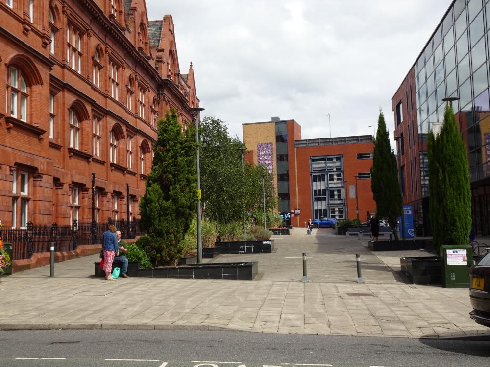
In Between

Photo: Dennis Seddon (Sony DSC-HX99)
No comparison.
‘The good, the bad and the ugly’.
The ‘bad ‘ there’s hardly anybody about and the
‘ugly’ I don’t even need to mention.
Grown-up building versus thrown-up building; pride versus speed. Just my own opinion. I don't expect everyone to agree with it.
These days buildings aren't intended to last many decades, things change so quickly that they become difficult to adapt to a modern application. You only need look at the ""old" civic centre building, and the "old" shopping centre to prove that. I wonder when the replacement market hall will appear it was given as late 2024 but that seems unlikely
Looks good to me and nice to see trees added
The thing on the right will be a lovely bright, warm and cosy place to work.
I do not see anything wrong with any of the buildings or the area.
Lovely picture Dennis of the old and the new. I know which I prefer! Freddie. I was talking to one of the market stall holders last week and they have been told that work is to start on the new Market this month. I wouldn't hold my breath though and I doubt it will be as pleasing to the eye as the current one.
I know I am on record on here regarding my opinion of Edwardian and Victorian architecture, but here goes again !! I find the building on the left and all it's contemporaries around Wigan hideous. The building on the right is functional and, to my eyes, not unattractive. Just my opinion, and I respect other people's opinions on the subject.
I much prefer the old Mining & Technical College building that still oozes character after being in use for 121 years, and will still be there in another 121 years, far outliving those modern plain plastic looking buildings.
Whatever people's opinions are on modern versus classic...I think Cyril has a very valid point .
DerekB, how different we all are in how we see things, but how nice to respect each other's view without argument on here. Thankyou for your very fair opinion and your kind words.
I just hope there’s no plastic ‘padding’ inserted anywhere behind the walls in that ‘conservatory’ type building. Makes you wonder after the Grenfell disaster what lies beneath in modern public buildings.
They spend a fortune putting up glass houses to let more light in… then they spend another fortune putting blinds up to keep the light out. How is that functional?
Just asking!
The building on the right would have looked much more attractive and substantial if proper bricks had been used instead of the cheap looking imitation brick cladding.
Kept my powder dry today as opinions regarding architecture can be controversial and devisive.
In one sense I agree with Cyril but I think I agree mostly with Derek B.
Good photo Dennis.
Dig up all the conifers.
Transplant the other trees over to the front of the building on the right.
Hey presto!
Visitors passing along Library st will be able to see the monument for our miners.
I agree wIth you on that, TD....the miners' monument isn't really in a good place to be seen, and yet if it was in the centre of town I would fear problems from vandals, especially at night. I often wish it could have been sited in The Grand Arcade where it would be locked safely away during the night after the shops close.
Colin, I wasn't disagreeing entirely with Derek, because those new builds aren't exactly an ugly concrete lump like as is the redundant Civic Centre, though Irene is correct in saying that they were thrown up along with Freddie rightly saying that they aren't built to last now.
Is the swimming baths still in the building to the right?
only you never hear of children or adults too saying they're going to the baths.