Photo-a-Day (Monday, 28th November, 2016)
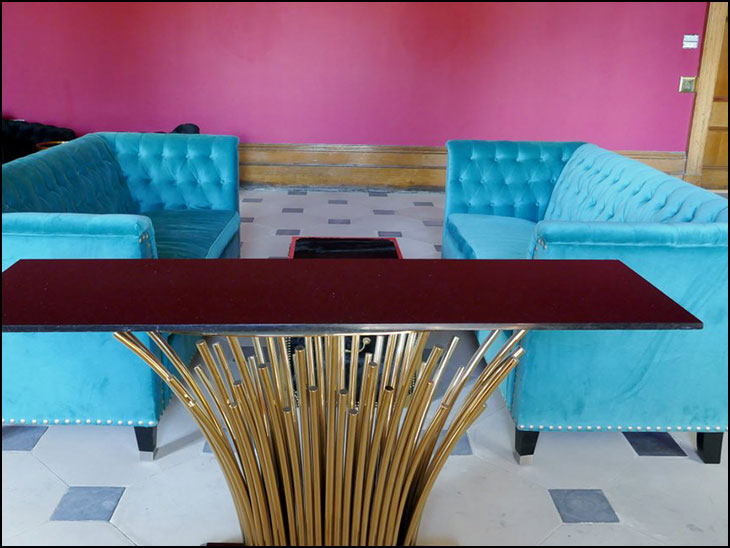
New furniture

happened to the antique elephant leg table.
Photo: Mick Byrne (Panasonic TZ100)
Arggg my eyes. Hideous!
That is horribly tacky !
That is so cold and unwelcoming.
well I wonder who came up with that colour scheme?
Ridiculous.
It resembles part of a modern American church organ, or German modern art.
Horrible colours.
Those pipes look just right for pushing ciggy butts down.
Horrible setup.
A friend of mine went into Haigh Hall recently and said it looked cheap and tacky, and other visitors agreed. I think the new owner should have gone to Specsavers.
OMG! How awful!
Yeuch!!
I think the very glamorous Wigan brides who will be using it will love it.
OMG just looking at the photo that is terrible, will have to go up there and have a look, cant imagine where that is in the Hall, hope it looks different when looking at it from the staircase.
Tastelessness at its best.
All the money in the world can't buy taste - sad to say it looks like a Barbie salon! If the Hall is haunted I'm sure the ghosts will depart now!!! On the other hand if the owners are happy.......!
I think it's great. In fact, the last time I was round at Ray Charles' place, I seem to recall he had something very similar.
Good grief! That table looks like something left over at the end of a Car Boot Sale.
Well Mr. Baker you seem to have everyone onside with this.
PS Mick I think the elephant leg table 'hopped' it quick!
Let's hope that they do a better job with the rest of the hotel :(
Mick have you sent a photo into PAD of the equally horrible new car park that they've put in front of the hall?
I agree with everyone that it is awful. I would add with respect that it was probably a woman that was the designer. It doesn't look very manly.
The cost of this redecoration will doubtlessly be passed on to the paying guests and probably push up the hotel room prices by at least 20p a night.
Looks like a sympathetic renovation.
Thanks for sharing, Mick.
It does not fit the building. Like most of the others have said - bad taste. What have they done with the lovely staircase that you enter from this room. I also wonder what they have done or will do in the rooms with the magnificent ceilings. Can't understand why Wigan Council have not insisted the inside of the hotel is in keeping with the building.
Are they hoping to attract the "Rough Sleeper" trade?
Very modern and up to date, nice colours.
Some people have no taste!!!
Some people have no manners, everyone is entitled to an opinion.
Minimalist and modern. The younger generation will love it. I expect its the younger set that they want to attract.
Yes it is a young person's style of decor which wouldn't be out of place in a private house. That said it will be out of date in 18months if not sooner! The style doesn't do justice to the Hall which is historical and should have been treated as such in a more timeless fashion ....perhaps with a slight contemporary twist -not full blown and in 'your face' shocking pink!
I love it. Modern and fresh. Not fuddy, duddy, stick in the mud, brown!