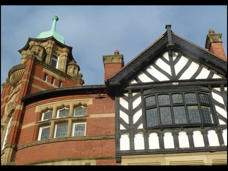
Photo-a-Day (Tuesday, 25th November, 2014)
Market Place
Nice one Neil, the corner of Market Place with Market Street. Excellent clear photo.
You can keep all your glass, chrome and glitzy
plazas, malls, shopping centres etc...this is Wigan for me. Its something probably not looked up at much by people below in the street.
Helen, you are spot on. Architects in the past created beautiful buildings. Today it's all straight lines, concrete, metal, glass. Ugly, soulless, depressing monstrosities, and unfortunately Wigan has more than it's fair share. At least we still have a few reminders like Neil's photo of how better things could be.
Nice angle, Neil.
I agree with Helen.
Yes, I also agree with Helen, i don't look up, so don't appreciate the architecture, a very good angle and good photo.
But the thing is some of these new concrete, metal, glass ugly, soulless, depressing monstrosities that some of you dont like keep the rain out and the heat in unlike the old fashioned leaky damp ones of days gone bye.
Directly I saw it I though that I had come home, it is the essence of the Wigan that I knew when I was growing up.
Neil has only just come to live in Wigan, and I have lived here all my life, but he has pointed out to me things I had never seen in Wigan town centre because I have just never looked up. I totally agree with Helen and I thought Maggie's sentiments were very touching. Neil's Dad and Grandad were from Ince, and Neil, who has always had a great love for Wigan and its people, also feels he has come home. So Welcome Home, Neil!
Will this corner still be here after the proposed redevelopment? From what I have seen of the plans to move the Market Hall to this site we will have a glass and steel monstrosity in it's place.More vandalism by our cash strapped council.
Thanks for the nice responses. Mick has a point in sofar as these days we need energy efficient buildings but surely this can be allied to a bit of styling, form and proportion. Some colour schemes on buildings around and about are offensive to most eyes. Witness what replaced the Seven Stars.Still everyone has their own opinion, let's just hope we don't lose anymore of the older buildings unnecessarily.
You're welcome Neil. Next time we're in Wigan admiring the architecture, you owe me a pie!
Neil the new building at the Seven Stars is a lovely modern car showroom.
I wonder how many would like to go on holiday and stay in a hotel that had rooms and windows like the one in the photo of the day.
You can just imagine all the drafts coming through the gaps and the steamed up window in a morning.
Mick get real lots of hotels are older than these buildings and are ok what is the so called posh places youve been in like.
The new building at Seven Stars is empty and been up for rent for months
It seems to me that the design of homes has improved in the last decade and these must conform to high standards of energy efficiency, however ,in the main, public and corporate buildings haven't followed suit in terms of being pleasing to the eye.Others will take issue with me but I suspect more agree than disagree.
--somewhat belatedly!! Couldn't agree more with Helen and with Maggie!
Great shot Neil!
The times I've walked past here and not realised the architecture above. In Italy its in your face constantly!
Must look up more and risk a pain in the neck! ;-)
Thanks Giovanni, if I crash into someone as I look up it may be you.
I could be saying "scusi" alot!
What are we looking at????
could you please show some pics of worsley hall pemberton norley hall
and not so many of haigh hall
Get out yourself, Brian!
