Photo-a-Day (Friday, 25th July, 2014)
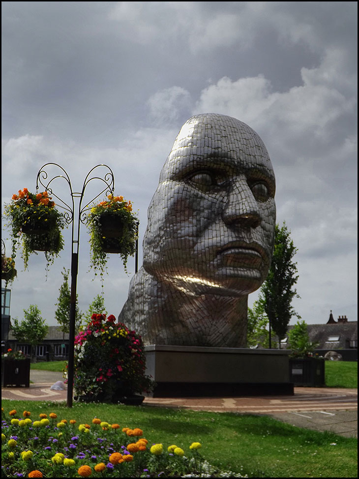
Face of Wigan
The face of Wigan Eh!. It looks nothing like Billy Boston.
Its been up the Wiend that long it looks fed up
Another irrelevant waste of money, courtesy of the pin-brains in the town hall !
Boring! The Council should have spent Our money on the "patched up" roads, what a waste this object is. The flowers and plants are a much better show. Neil the photos good, the face isn't.
with all the youth unemployment in and around Wigan one would think the councillor's could think of better ways to spend the rates payers money.
I like it. I was there in the dark when they installed it in December 2008.
The Council didn't pay for it of course. It was paid for by Grand Arcade developers MODUS.
I like it. You should see some of the rubbish that the council have put in Plymouth!
EEEK ! What a sight. Nearly frightened me to death!
Is this really supposed to be our beloved Billy Boston ???
If so what an insult. And what planet are 'they' on ?
Lovely pic of the flowers though, Neil
Ugly mug, is that the real face of Wigan?
I like this too. At least Wigan is interesting.
This 'artwork' is appearing all over the country throughout towns and cities and it's not by accident either. I believe there is an agenda behind this, what I would call 'ugly, meaningless, soulless and depressing artwork'. I think it's put there to make people confused and feel uneasy. I've heard about the Plymouth artwork too, some really bizarre artwork there. I've heard people describe this artwork has satanic. The short answer to why did the council spend money on this abomination is simple: they don't give two hoots about the public and whether we like it or not. And besides, the local council's have no say as they're only puppets of the govt.
Not interested in Plymouth. Their will be a Council connection somewhere. It should have stayed in the dark..horrible sight. Nice flowers though Neil, with no tricks, good honest shot. Wigan IS interesting, but not with the face.
Tricia, this is not meant to be Billy Boston but plans are now in place to have a statue of the great man made and installed in the town centre. Not before time.
The Face that sunk a thousand shops! It's hideous!
There nothing wrong with it except its in the wrong place, it would have been better in the market place so more people could see it.
And likes been said already the council didnt pay for it
I think it's two faced! Good point Irene.
Hi Mick. Market Place!! Not sure about that. Perhaps on a high hill somewhere, it would look quite haunting against a dark thunderous sky. It somehow looks lost here. Like it though, just wrong place in my eyes.
Great photo, I like the sky colour, blue would have been wrong. By the way what happened to the market place plan to have fountains there.
I remember a question being asked about this before - is it art?
I like the hanging baskets better.
I love it!
