Photo-a-Day (Thursday, 23rd February, 2012)
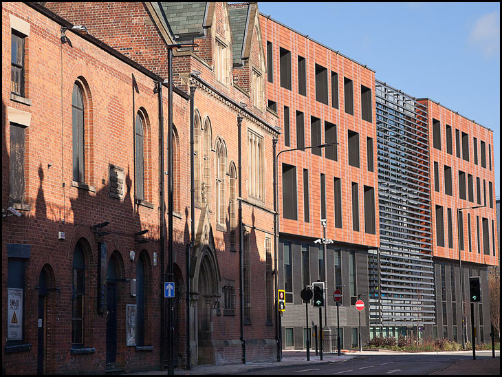
History Shop

Photo: Andrew Fishburn (Canon EOS 5D)
Looking at the architecture of both buildings, I know which I prefer. The history shop may be neglected but it is far superior to the Lego building. Also on the new Life centre,the designers have provided access to the roof by way of a nice ladder. I wonder if it is alarmed.
What an excellent contrast between the highly attractive architecture of an earlier age, and what passes for design these days. Does anybody in Wigan prefer the modern version? I, for one, do not.
A more natural look of Wigan.
The road signs say it .One way sign look up at the nice building,The no entry sign says it all
there is a place for modern and older buildings - Look at any major city and you will see examples everywhere.
Would someone tell Wigan Council where they can buy some more lego as they appear to have run out of bricks. Besides looking like a prison, the place looks half-finished.
The History Shop has just had more than 1 million of our Great British Pounds spent on its refurbishment, so to say it's been neglected may be a bit unfair.
These Town Centre Projects are very costly. So.how much are we prepared to spend?
The History Shop has just had more than 1 million of our Great British Pounds spent on its refurbishment, so to say it's been neglected may be a bit unfair.
These Town Centre Projects are very costly. So.how much are we prepared to spend?
I prefer the old look. That new building is ugly and soulless. This is what the government want in our faces, not things of beauty but things of emptiness that are designed to depress us even more; what with all the surveilance watching our every move as well. And what's with the meaningless art we have in town, namely the face of Wigan & the metal spikes next to Standishgate. What's all that about?
If you complain about these monstrosities, all you get is: "We've had a lot of positive feedback". That's because they only listen to the feedback they want to hear, not the voice of 90% of the people.
I think that both types of architecture have their place. After all think of some of the stunning Shard in London. That's modern architecture.
Derek the History Shop is not neglected it has had a full facelift inside and out.
Pitty they couldn't do something with the buildings next to the History Shop
I can see myself, as Fred,I have an
old"Myford" lathe, and scour car boot sales, for bits of old brass etc'to scratch build any thing that
looks like a steam engine.And I enjoy,being an eccentric'in that
regard. Cheers Neil
I must stop repeating myself. I must stop repeating myself.
I like to see the old buildings and I listen and read the comments here, but you cant have every building an old building. To build in the old style is virtually impossible thse days, one of the most difficult and the most expensive is finding the "trades people" to do the work.
Oil give it foive.
Sorry guys, I've been too long away from Wigan. I guess I was making comments about the building next door. Didn't notice the roof line
I'm not a fan of the new buildings but at least the trend to using red brick ties in better with the older buildings, as opposed to the police station, the demolished baths and the civic building at the top of Millgate.
Like it or not we have to move with the times. I reckon the new building is fit for the 21st Century.
Cloth cap image begone!
Takes me back, used to work at the Library when I left Wigan Girls High School in the 50's. Sometimes down stairs, sometimes in the reference library upstairs and sometimes in the reading room round the side.
Mmmm....well you could say they have tried... & Ken R you could also say that Wigan Council ( or whatever they call themselves) could get ' expensive ' trades people, as they certainly seem to throw money about building momuments for themselves...just think what T Blair will be remembered for... not only a war..a dome that will too become an eyesore eventually.
So what is going to happen to to the land at the back of FRANCO'S ?
A late comment I know but for what it's worth, in my opinion one of the "curses" of modern design is that when you have a "flat" roof style it always looks unfinished. A roof with angles and preferably a slate finish, barge boards, sometimes with a slight overhang are all design features that knock into a "cocked hat" the unfinished look that flat roofs look which by comparison seem utilitarian and completely lacking in character. They may be cheaper but boy do they look it.