Blog
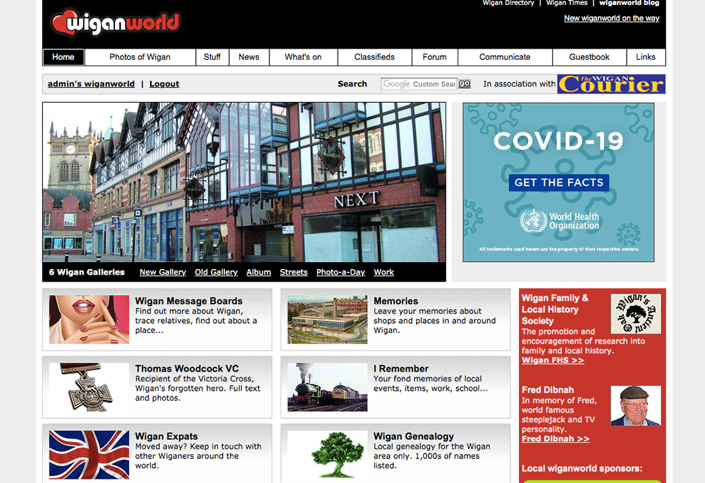
Welcome to the new look wiganworld
Published by Brian on Wednesday 10th June 2020
It's taken an age but I've finally done it - a much needed rewrite. Time is precious but lately, due to the lockdown, I've had plenty of free time. Hope you like it, there are a few changes...
Gone
News - I didn't update this section regularly and local news is available in abundance elsewhere.
Forum - Wasn't busy, will concentrate on the message boards.
New
Blog - You're reading it now. The blog replaces the news. I hope to update it regularly.
Improvements
Album - The album is one the busiest sections on the site. When you visit the new album, recently uploaded photos are shown (as before). However, you can click page after page to view photos rather than the old site only allowing 10 pages.
Another improvement to the album, you can click the button "View by Recently Commented" to show photos with recent comments. On the old site, these comments would have gone unnoticed.
New Gallery - I've rewritten this section to work like the album. It's now possible to leave comments in the new gallery, this wasn't possible before. If I get a surplus of Photo-a-Day submissions, I will add the photos to this section so all photo contributions are used. At the moment only I can add new photos.
Obviously there are other improvements, mainly a new design which is responsive. This means wiganworld will work across all devices including iPads, iPhones etc. at any resolution.
I've tried my best to keep the new site like the old site, ie. the same sections, same pages, familiar layout. In the past when I've updated there were many complaints like "I don't like it, bring back the old site", hope you agree the new site update this time is better.
There may be a bug or quirk here or there, if you spot one, please let me know, thank you.

I can't login, I put my correct username and password in, and it wasn't accepted, I checked and double checked both, and I was already logged in today.
Cheers Maurice
Is it any easier now to post pics and videos i couldn't get the hang of it before
How do you get to ince streets with all house names and numbers from the past 1930?
Please..how do I find People hobbies and books etc.
Well done Brian for all the hard work you have put in to Wiganworld.
Thats a good idea adding surplus Photo-a-Day submissions to the new gallery
Much better format.Thanks Brian and colleagues.
Thanks for all your hard work in keeping the site maintained and up and running. My first impression was that it's lost some of it's historical character and too clean and sterile. I've been using the site for so long I knew exactly where everything was before, but it won't take long to get used to it.
Where has the ince directory gone?
When I try to upload a pic to
Assorted - *UNKNOWN* - Can You Help?
I get
Fatal error: Allowed memory size of 33554432 bytes exhausted (tried to allocate 3235 bytes) in /home/wiganer/public_html/album/albumup3.php on line 74
tried on windows10 with Chrome, Opera and Edge
Thanks for the comments.
Owd viewer, its in the same place as before. Click 'Stuff' at top then you'll see it on the big vertical menu on left.
Jim, can you try again please? I've increased max upload size in the script - maybe it will work now? If not, please email me the image so I can have a play, thanks.
yep, just tried, looks good now. thanks.
I think in the past I had problems with pics of wide pixel sizes and had to reduce the pixel width, but always managed eventually.
[url="https://www.wiganworld.co.uk/blog/images/old.gif"]Waring and Gillow[/url]
[url="https://www.wiganworld.co.uk/"]M.F.I.[/url]
[url=" "] [/url]
Posted on DG12 and a test page on handbags with three seperate columns but on each thread the three columns are compressed together with no gaps between DG -VIEWS-REPLIES.?
This new web is an absolute disaster. It is so difficult to operate. No compare to the previous web. It must have been designed by Trump, or someone as stupid.
Thanks for your input Alan. Please email me for a full refund.
Well done Brian, good come back to Alan
On the COMMUNICATE home page the 'Places' & 'People' links have been transposed. The 'People' link goes to 'Places' and vice versa.
I find the Cemeteries boards very inconvenient to use in their new layout, I hate having to scroll to see all the information.